Brand Insights
For Health Science Executives
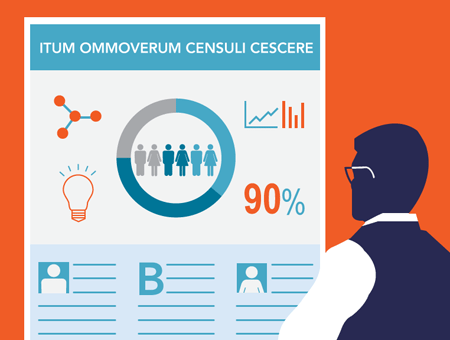
4 Design Tips for Creating a Show-Stopping Scientific Poster
4 Design Tips for Creating a Show-Stopping Scientific Poster
Making a great presentation poster that stands out from the rest isn’t rocket science. Follow these four easy design tips to create a poster that gets attention and communicates your research clearly.
Posters are widely used as presentation aids in science and medical academia. They summarize information and scientific data concisely to help the researcher generate interest in their work. In the case of a conference or media event, there can be many presenters vying for the attendees and their attention. A well designed poster can make the difference between having a line in front of yours, or spending the afternoon checking your email.
Here are four design tips for creating a scientific poster that will generate interest in your research, and leave a lasting impression with your audience:
Tip 1: Know what’s most important
Audiences have short attention spans, so it’s critical to know what you want to communicate most. As you prepare to create your poster, ask yourself this question: “What’s the most important finding from my research project?” This will help you determine the “visual hierarchy” or level of visual importance each segment of your research should receive on the poster.
Try to separate out your findings into 3-4 tiers of importance so that there is a clear order and consistency to your information and how it is displayed.
Tier 1: Header/Title of poster
Tier 2: Important statistics or charts
Tier 3: More text heavy sections that explain specific aspects of your research in greater
Tip 2: Make it attractive, not exhaustive
Here are a few ways that you can make sure your poster is attractive and easy to digest without compromising your content:
- Keep the main title short and interesting. Think of it as the hook that will draw attention and get people to come and learn more about your work.
- Headlines and important facts or statistics should be readable from about 10 feet away
- Word count of about 300 to 800 words
- Copy should be clear and to the point
- Make use of any key numbers or statistics that are attached to your research findings/work. The most important ones should stand out and act as aids for the viewer so that they can scan the poster more easily, using these graphic callouts as visual anchor points.
- Effective use of graphics, color and fonts
- Consistent and clean layout
Tip 3: Make the takeaways obvious without explanation
These guidelines should make your poster visually appealing, but keep in mind that content is still key. The visuals should draw your audience in, allowing them to digest and understand your research with or without you being present
Tip 4: Use software that you’re comfortable with
Adobe software like Photoshop and Indesign is the choice for design professionals, but these programs can often take hours of classes to learn and they come with a pretty hefty price tag. You may be better off using Microsoft PowerPoint or Publisher, especially if you already use them on a daily basis. Both are part of Microsoft Office and are fairly standard presentation tools, offering templates for things that will be useful in your presentation, like charts, graphs and other visual aids.
There are open-source software options as well — use whatever works best for you. Better yet, reach out to your communications team to see if they can lend you a hand. They’re more likely to have professional design software and the expertise to make your poster look great and more important, get your message understood.