Brand Insights
For Health Science Executives
Designing Email Campaigns With Greater Mobility And Impact
Designing Email Campaigns With Greater Mobility And Impact
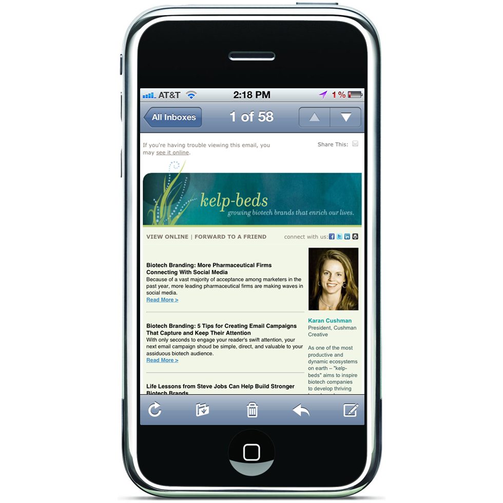
Everyday more people are viewing emails on mobile devices, so to ensure maximum impact for your biotech brand, design with intention for both desktop and mobile readers.
Before you hit send on your next email campaign consider the various platforms your subscriber may be using today. Sure many will view on their desktop, but more people are checking email on the go and often before they even touch their desktop computer in the morning. Mobile devices with their smaller screens and various operating systems all interpret your email differently.
Here are a few tips for harnessing the mobile variables and ensuring your next email campaign sparks action!
Design for Your Audience
Just like with website design, the success of your next email campaign is driven by the user-interface you create for your specific audience. The success of your next campaign is determined by how well you present your information and enable your users to interact. So here we go!….
Short and Sweet Subjects
Mobile subscribers are often reading your message with other distractions nearby or in between other tasks. A shorter subject line telling them the benefit of opening your email may spark more interest than another “February News” blast.
Trim Your Waist
We all know mobile devices scale down your content to fit a smaller screen. Androids, however, only show a portion of your email by default (approx 320px wide). Be careful of important content that may be cut-off or require too much scrolling to easily be read. On most other mobile other devices your email is sized down overall to the exact width of the device. Anna Yeaman, creative director at Style Campaign, shared her thoughts on these details with email-marketing service EMMA recently. She suggests an overall layout width between 480-520 pixels as the Android, Window Phone 7 and Blackberry all have popular devices with that resolution.
Make Your Call-To-Action Stand Out
One of the most important parts of any effective email design is a strong and obvious call-to-action. Make sure your offer and your links are prominent and tappable* so your viewer can immediately click-through – a well-designed graphic can help.
Less is Typically More
Using a layout with only one or two columns keeps your design simple and legible across the variety of interfaces – from desktop to mobile devices. But when it comes to mobile, always be sure to test how your information is scaled and cropped on-screen by different the operating systems. For us a two-column layout on an Android (which only displays a portion of your email) keeps our main content large and our sidebar info accessible with a simple side scroll.
Make it Easy to Share
Be mindful of where your sharing and social icons appear in your mobile layout. Making it easy for readers to find them and keeping icons a tappable* size will encourage a quick share.
Minimize Images
Which images deliver your message best? By eliminating images that don’t serve an immediate purpose your main message will be strong and you’ll avoid awkward text breaks and scrolling issues that can result from including too many images.
Increase Font Sizes
Make your vital points stand out. Typically fonts should be set larger as mobile users often give just a quick glance when reading on a small screen. Some systems resize fonts smaller than 12 pixels up to 12 causing unpleasant breaks in your layout. Stay safe by keeping headlines to 22 pixels and body text 12-14 pixels. You can turn auto-scaling off with the addition of some simple code.
Test, test, test!
Technology changes daily so testing across all the current interfaces is key. There are a few options for testing emails. For high-volume email senders, Litmus offers the ability to test emails through the variety of web browsers and mobile devices for a monthly fee. You can share your results as well. If you are just sending a few emails a month Email on Acid, a pay-per-use email preview and deliverability service, may be a better option.
According to Apple’s Human Interface guidelines a tappable graphic is at least 44 x 44 pixels.
Miles Price at EMMA also wrote a post on this subject recently. Thanks for your collaboration, Miles!
Click the following link to read more about using mobile devices to market your biotech brand: Mobilize your Biotech Marketing

